Cmd+Alt+I
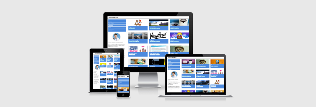
As a ‘mobile first’ digital product designer (how wan*y does that sound?!?) it’s much easier said than done to experience the web as a lot of your users will do – on a mobile device.
Those of us that sit on our lovely MacBook Pros making websites will always struggle to design with the reduced viewport first… Having been through the process, there really is such a huge difference in your thought and design process if you are truly designing for our portrait pals rather than just amending a desktop design reduced to fit…
As such, i am going to spend the next week, with my browser permanently resized to a mobile width.
I’ll let you know what i learn and if it helps think a little bit differently
Oh – and before anyone says it – i realise that i am not getting the full mobile experience (touch, location, camera etc) – but it might be better than nothing… it might be rubbish


